
The most effective types of call to action for creator posts fall into five core categories: engagement (comments, saves, shares), follow/subscribe, traffic (link clicks), conversion/commerce, and UGC/participation. Which one you use depends entirely on what you want the post to do.
A few quick examples to make that concrete:
- Engagement: “Drop a 🔥 if you agree” or “Save this for later”
- Follow/subscribe: “Follow for a new tip every Tuesday”
- Traffic: “Full tutorial linked in bio”
- Conversion/commerce: “Shop the look via the link below”
- UGC/participation: “Tag a friend who needs to see this”
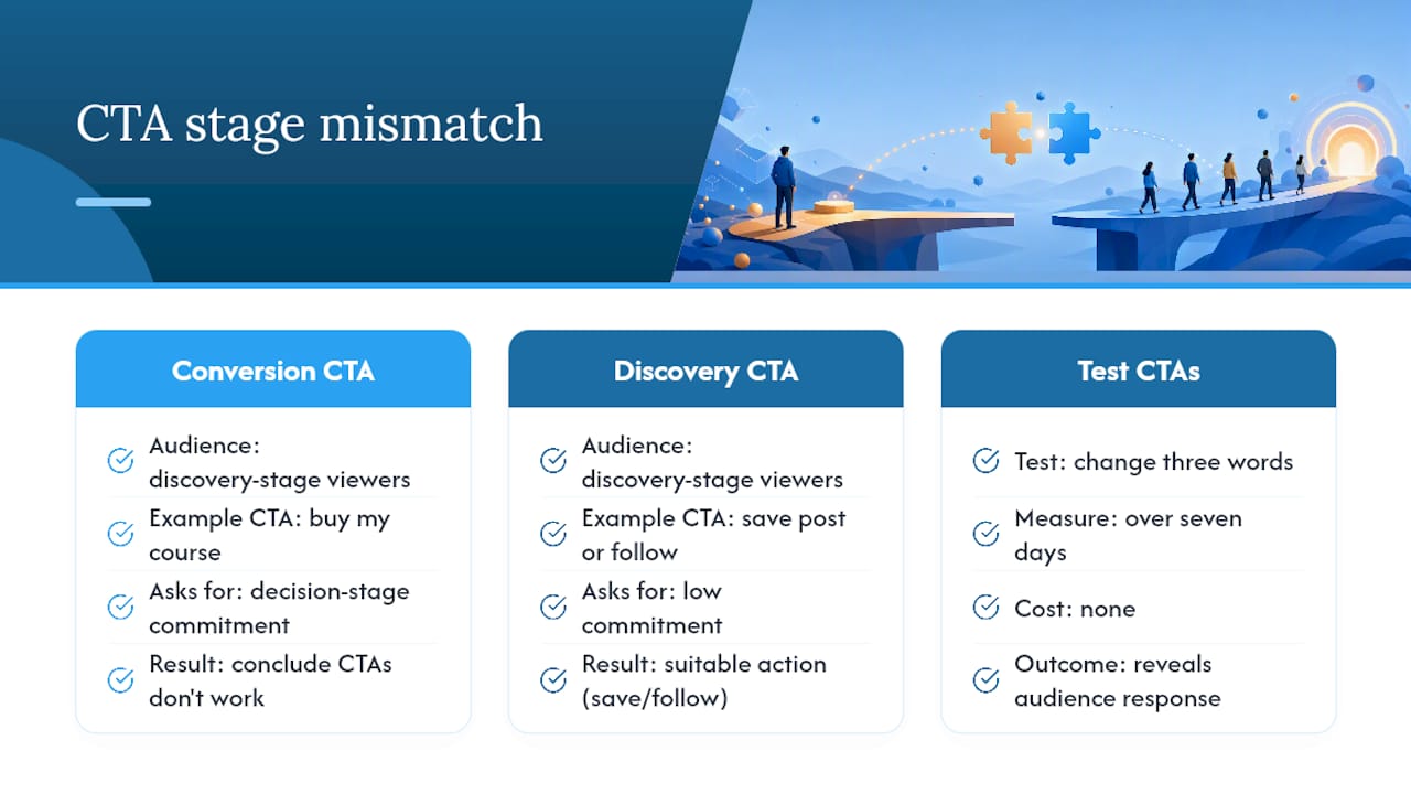
Match the CTA to the post goal and the audience’s readiness. Someone discovering you for the first time needs a low-commitment ask (“save this”). A warm follower who already trusts you is ready for “grab the course.”
Pro Tip: A single post with one clear CTA consistently outperforms a post that asks the viewer to comment, share, follow, and click a link all at once. Pick one goal per post.
Key takeaways
The most effective CTA strategy for creator posts is matching a single, benefit-first ask to the audience’s readiness stage, then testing copy before anything else.
| Point | Details |
|---|---|
| One CTA per post | Multiple competing asks split attention and reduce performance across all of them. |
| Match CTA to audience stage | Discovery viewers need low-commitment asks (save, follow); warm audiences are ready for traffic or conversion CTAs. |
| Lead with the benefit | “Get my free checklist” outperforms “click here” because it answers what the viewer receives. |
| Test copy first | Copy changes are the fastest, highest-impact experiments; test one variable for 7 days minimum. |
| Disclose affiliate CTAs | UK ASA and CMA rules require “#ad” or “#sponsored” to appear prominently alongside any paid or affiliate CTA. |
| Greediersocialmedia | Builds the real, active UK audience that makes every CTA test more meaningful and every post more responsive. |
Table of Contents
- What makes a social-post CTA different from a website CTA?
- What types of call to action should creators use on posts?
- How do CTA patterns differ across Instagram, TikTok, YouTube, Facebook, and X?
- How do you write high-converting CTA copy for creator posts?
- What design and placement rules make creator CTAs actually work?
- How do you test CTAs and measure what’s actually working?
- Agency-tested tips from Greediersocialmedia for UK creators
- How do you pick the right CTA for a given post in under a minute?
- Why creators get CTAs wrong more often than they realise
- Greediersocialmedia helps UK creators build the engagement that makes CTAs land
- Sources
- FAQ
What makes a social-post CTA different from a website CTA?
A call to action (CTA) is a direct instruction that tells your audience what to do next. On a website, that might be a button that says “Start free trial.” On a creator post, the same principle applies, but the format, tone, and delivery are entirely different.
Website CTAs live on buttons with high contrast and clear visual hierarchy. Creator CTAs live in captions, on-screen text overlays, spoken audio, story stickers, and pinned comments. They often need to work across all three simultaneously. A viewer watching a Reel on mute needs the on-screen text; a viewer listening while commuting needs the spoken version.
Platform constraints shape everything. Instagram captions truncate after roughly 125 characters before the “more” tap, so the CTA needs to appear early or be repeated at the end. TikTok’s native comment pinning lets creators reinforce a CTA after posting. YouTube allows clickable end-screen cards and description links. Facebook posts support link previews natively. X and Threads rely almost entirely on caption copy, with no native link sticker equivalent.
For UK creators running affiliate or brand-deal content, the Advertising Standards Authority (ASA) and the Competition and Markets Authority (CMA) require clear disclosure. Any CTA attached to a paid promotion must sit alongside a visible label such as “#ad” or “#sponsored.” This is not optional, and it applies regardless of platform.
What types of call to action should creators use on posts?
CTAs can be usefully categorised into groups such as direct action, informational, social sharing, feedback, and personalised CTAs, each serving different objectives. For creators specifically, the practical taxonomy looks like this:
1. Engagement CTAs
Goal: Drive comments, saves, likes, and shares to boost algorithmic reach.
When to use: Any post where you want the algorithm to push it further. Saves are particularly powerful on Instagram because they signal high-value content.
Examples:
- “Save this so you don’t forget it”
- “Comment your answer below”
- “Which one would you choose? A or B?”
- “Share this with someone who needs to hear it”
2. Follow/subscribe CTAs
Goal: Convert a viewer into a long-term audience member.
When to use: High-reach posts, collaborations, viral moments, or any content attracting new viewers who do not yet follow you.
Examples:
- “Follow for more like this every week”
- “Subscribe so you never miss a drop”
- “Hit follow if this helped you”
3. Traffic CTAs
Goal: Move the audience off-platform to a blog, newsletter, YouTube channel, or landing page.
When to use: When the post is a teaser or summary of longer content. Works best when the off-platform destination delivers clear additional value.
Examples:
- “Full breakdown linked in bio”
- “Read the complete guide at the link below”
- “Watch the full video on YouTube”
4. Conversion/commerce CTAs
Goal: Drive a purchase, sign-up, or download.
When to use: Product reveals, tutorials featuring a product, limited-time offers, or affiliate content. Pair with urgency cues only when the deadline is real.
Examples:
- “Shop the look via the link in bio”
- “Grab your copy before it sells out”
- “Use code [NAME] for 15% off”
Benefit-oriented CTA copy that tells users what they receive performs better than obligation-oriented copy. “Get my guide” outperforms “Submit” or “Register” every time. Keep button or overlay copy to 2–5 words.
5. UGC/participation CTAs
Goal: Generate user-created content, community involvement, or social proof.
When to use: Community-building posts, challenges, product launches where you want organic buzz.
Examples:
- “Tag us in your version”
- “Duet this with your take”
- “Use #[YourHashtag] and we’ll reshare our favourites”
6. Feedback/poll CTAs
Goal: Gather audience insight and create two-way conversation.
When to use: Story polls, question stickers, caption-based surveys. Excellent for content planning and audience research.
Examples:
- “Poll: which topic next? 👆”
- “Reply with your biggest challenge”
- “Vote in my story”
7. Referral/share CTAs
Goal: Extend organic reach through peer sharing.
Examples:
- “Send this to a friend who’s starting out”
- “Share to your story if this resonated”
8. Event/booking CTAs
Goal: Drive registrations, RSVPs, or ticket purchases.
Examples:
- “Register for the free webinar — link in bio”
- “Book your spot before Thursday”
9. Lead capture/subscription CTAs
Goal: Build an email list or newsletter audience.
Examples:
- “Sign up for weekly tips — link in bio”
- “Join 10,000 subscribers getting this every Friday”
Pro Tip: Never stack more than one CTA in a single post. If you want both a follow and a link click, choose the one that matters more for this post’s goal. Two competing asks split attention and reduce both.
How do CTA patterns differ across Instagram, TikTok, YouTube, Facebook, and X?
Posts and carousels: Place the CTA in the first 125 characters of the caption so it appears before the “more” tap. Repeat it at the end for viewers who scroll through. Saves and shares are the highest-value engagement signals, so “save this” is often the smartest default for educational content.
Stories: Use the native link sticker for traffic CTAs. Poll stickers and question stickers handle feedback CTAs natively. Keep on-screen text short (under 6 words) and position it away from the bottom 20% of the screen where the sticker tray sits.
Reels: Deliver the CTA spoken at the 15–20 second mark and again at the end. Overlay it as on-screen text simultaneously. Pairing spoken and visual CTAs reinforces the action for both muted and unmuted viewers. Pin a comment with the CTA link immediately after posting.
For affiliate or brand-deal Reels, the “#ad” label must appear in the caption and ideally on-screen, not buried after several hashtags.
For more on boosting Instagram engagement through placement and caption mechanics, Greediersocialmedia has a dedicated guide.
TikTok
TikTok’s algorithm rewards watch time and completion rate, so place the CTA at the end of the video rather than interrupting the content mid-way. Use on-screen text overlays timed to the final 3–5 seconds. The pinned comment is TikTok’s most underused CTA tool: pin a comment with the link or the instruction immediately after publishing.
Duet and Stitch CTAs (“Duet this with your version”) are native to TikTok and generate UGC at scale. For affiliate content, TikTok’s own disclosure tool must be used in addition to a caption label.
Examples:
- “Comment ‘LINK’ and I’ll send it to you”
- “Stitch this with your answer”
- “Follow for part 2 tomorrow”
YouTube
Long-form YouTube content supports end-screen cards (appearing in the final 20 seconds) and info cards (mid-video). These are clickable overlays that function as visual CTAs. The description’s first two lines are visible without expanding, so place the primary traffic or conversion CTA there.
For Shorts, the CTA must be spoken and on-screen within the first 15 seconds. There are no clickable overlays in Shorts, so the caption and pinned comment carry the traffic CTA.
Examples:
- “Subscribe and hit the bell so you never miss a video”
- “Watch the full series — linked in the description”
- “Join the channel membership for exclusive content”
Matching the CTA to the content type matters: a tutorial video suits a “save/bookmark” CTA or a “download the checklist” traffic CTA far better than a hard sell.
Facebook posts support native link previews, so a traffic CTA in the caption is reinforced visually by the preview card. Groups are particularly effective for feedback and participation CTAs because the community context makes asking questions feel natural.
Examples:
- “Drop your question in the comments and I’ll answer in tomorrow’s post”
- “Click the link to read the full breakdown”
- “Share this with your business page”
X and Threads
Both platforms are text-first. CTAs live entirely in the copy, with no native sticker or overlay tools. Keep them short and conversational. A reply CTA (“Reply with your take”) suits the platform’s discussion culture better than a hard conversion ask.
Examples:
- “RT if you agree”
- “Reply with your answer — I’ll share the best ones”
- “Thread below 👇”
How do you write high-converting CTA copy for creator posts?
The single most reliable rule: start with an action verb and lead with what the viewer gets, not what they have to do. Effective CTAs use action verbs, align with the offer, and include a clear value proposition. “Get the free checklist” beats “Click here” because it answers the viewer’s implicit question: what’s in it for me?
Action verbs that perform
High-performing verbs for creator posts include: get, save, watch, share, shop, join, grab, try, start, follow, comment, tag, send, book, download. Common high-performing words across creator content include “watch”, “save”, “share”, “shop”, and “get.”
Avoid passive or mechanical verbs: “click”, “submit”, “register”, “proceed.” They describe the action, not the benefit.
First-person vs second-person
First-person phrasing (“Get my guide”, “Start my free trial”) works well for self-service offers where the viewer is making a personal decision. Second-person (“Get your guide”, “Start your free trial”) works for most other cases. Using first-person phrasing for ownership-oriented offers can produce meaningful uplift versus second-person in some tests, so it is worth running both.
Length guidance
- On-screen overlays and stickers: 2–5 words maximum
- Caption CTA: 1–2 sentences
- Spoken CTA: 10–15 words, delivered at a natural pause
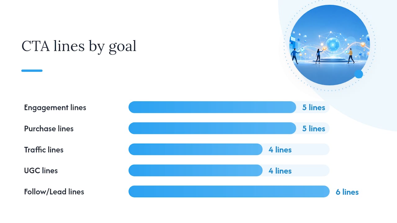
Swipe file: 25+ ready-to-copy CTA lines
Engagement:
- “Save this for when you need it”
- “Drop a comment with your answer”
- “Which would you pick? Tell me below”
- “Share this with someone who needs it”
- “Double tap if this helped”
Follow/subscribe:
- “Follow for a new tip every Tuesday”
- “Subscribe so you catch part 2”
- “Hit follow — I post this every week”
Traffic:
- “Full guide linked in bio”
- “Watch the complete breakdown on YouTube”
- “Read the full article at the link below”
- “Sign up for the free newsletter — link in bio”
Purchase/conversion:
- “Shop the look via the link in bio”
- “Grab yours before it sells out”
- “Use code [NAME] for 15% off today”
- “Book your spot — link below”
- “Get my — link in bio”
UGC/participation:
- “Tag a friend who needs this”
- “Duet this with your version”
- “Use #[hashtag] and we’ll reshare our favourites”
- “Reply with your biggest question”
Lead capture:
- “Join 10,000 subscribers — link in bio”
- “Get the free checklist delivered to your inbox”
- “Sign up for weekly tips — takes 10 seconds”
Short, testable CTA formulas like “Get [benefit]” and “Start my [resource]” create repeatable templates that are fast to A/B test. For deeper guidance on crafting CTAs for higher conversions, the principles of benefit-first framing apply across every platform.
Pro Tip: Test “Get my [thing]” against “Get your [thing]” on the same offer. Run each version for 7 days on comparable posts and compare click-through or save rates. The winning frame becomes your default for that audience.
What design and placement rules make creator CTAs actually work?
Visual rules for on-screen text
Contrast is non-negotiable. White text on a busy background disappears. Use a semi-transparent background box, a drop shadow, or position text over a plain area of the frame. Font size should be readable on a 5-inch mobile screen without zooming. A minimum of 24pt equivalent is a reasonable baseline.
Avoid centring text over moving footage. Left-aligned or bottom-anchored text is easier to read on mobile. Keep overlays away from the bottom 15% of the frame on TikTok and Reels, where the UI elements (like/comment buttons, username) sit.
Placement checklist
- End of narrative: Place the CTA after the value has been delivered, not before. Viewers who reach the end are already engaged.
- During a reveal: A product reveal or transformation moment is a natural hook for a commerce CTA.
- Pinned comment: Post the CTA link or instruction as the first comment and pin it immediately after publishing. This keeps it visible as organic comments accumulate.
- Caption close: Repeat the CTA at the end of the caption for viewers who read rather than watch.
- Story sticker placement: Centre-screen or upper-third placement gets more taps than bottom-screen stickers, which compete with the swipe-up gesture area.
Mobile-first and accessibility
Most social content is consumed on mobile, in portrait orientation, often with the sound off. Design every CTA to work without audio. Check contrast ratios: the The Web Content Accessibility Guidelines recommend a minimum contrast ratio of 4.5:1 for normal text. Tools like Using an accessibility checker like Adobe Color makes this a quick task-second task.
Switching from a text CTA to a button-style overlay has been documented to increase CTR by around 32.12% in specific case studies, which suggests that visual prominence matters as much as copy.
Pro Tip: Combine a spoken CTA, an on-screen text overlay, and a caption repeat, but use different phrasing for each. “Save this” on screen, “drop it in your saved folder” spoken, and “save for later” in the caption. Same action, three phrasings, no repetition fatigue.
How do you test CTAs and measure what’s actually working?
Testing priority: copy first, then placement, then design
Copy tests are the highest-leverage experiments because they are fast to run, simple to analyse, and often produce larger lifts than visual changes. Change one word in the CTA and measure the difference. Once you have a winning copy frame, test placement (end of video vs mid-video). Only then test visual design (colour, size, overlay style).
Analysing real-brand CTAs consistently shows that vague or misaligned CTAs underperform, while clear, benefit-focused ones succeed. The failure mode is almost always the same: the CTA asks for something the viewer is not yet ready to give.
Metric mapping by CTA type
Mapping each CTA type to the right KPI is what separates creators who improve from those who post and hope. Measuring a commerce CTA by likes is meaningless; measuring it by conversion rate tells you something real.
Simple A/B test template
- Choose one variable (the CTA copy only).
- Create two versions of the post with identical content but different CTA phrasing.
- Post both within 24 hours of each other (or use a scheduling tool to stagger by a few hours).
- Run for 7 days minimum before drawing conclusions.
- Declare a winner when one version shows at least a 20% difference in the target KPI.
Matching CTA commitment to buyer stage is the underlying logic: a discovery-stage viewer needs a low-commitment ask (“save this”); a warm follower who has watched several of your videos is ready for “grab the course.” Testing reveals which stage your audience is actually at, not which stage you assume they are at. For a structured approach to social media testing frameworks, Greediersocialmedia’s guide covers the full methodology.
Agency-tested tips from Greediersocialmedia for UK creators
Three tactics that consistently move the needle when coaching creators:
The single-CTA rule: One post, one ask. Every time a creator adds a second CTA (“and also follow me, and also check the link”), the primary CTA’s performance drops. Pick the goal that matters most for this post and cut the rest.
Benefit-first overlays: The on-screen text should answer “what do I get?” before it asks for anything. “Free checklist” before “click the link.” “Save £20” before “use the code.” The benefit earns the click; the instruction just directs it.
Pinned-comment follow-ups: After posting, pin a comment that repeats the CTA with the link or instruction. This is especially effective on Instagram Reels and TikTok, where the caption is not always visible during playback. Creators who do this consistently report higher link-click rates than those relying on the caption alone.
UK disclosure reminder: The ASA’s guidelines require that any post featuring a paid partnership, gifted product, or affiliate link is clearly labelled. “#ad” or “#sponsored” must appear prominently, not buried in a string of hashtags. This applies to CTAs too: if your CTA directs viewers to an affiliate link, the disclosure must be visible before or alongside the CTA, not after it. The Competition and Markets Authority has issued guidance specifically on influencer marketing, and enforcement has increased since 2023.
For creators looking to understand how audience segmentation affects CTA personalisation, Greediersocialmedia’s guide covers how to tailor CTAs to different follower segments for better results.
Pro Tip: If you are running affiliate CTAs, create a separate link for each platform. This lets you track which platform drives the most conversions, which tells you where to concentrate your CTA effort next month.
How do you pick the right CTA for a given post in under a minute?
A four-step decision flow:
- Identify the post goal. What does this post need to achieve? Reach, followers, traffic, sales, or community?
- Identify the audience stage. Are these new viewers (discovery), warm followers (consideration), or loyal fans (decision)?
- Choose the CTA family. Discovery stage → engagement or follow CTA. Consideration stage → traffic or lead capture CTA. Decision stage → conversion or commerce CTA.
- Pick a tested line from your swipe file. Use a formula you have already tested, or run a new variant against your current best.
Three mini use-case examples
Tutorial post: Goal is reach and saves. Audience is mixed (new and warm). CTA family: engagement. Line: “Save this so you have it when you need it.”
Product reveal: Goal is sales. Audience is warm followers. CTA family: conversion. Line: “Shop the full look via the link in bio.”
Community post (question or opinion): Goal is comments and connection. Audience is loyal fans. CTA family: engagement/feedback. Line: “Tell me your answer in the comments.”
Three sanity checks before you publish
- One CTA per post. If you have written two, delete the weaker one.
- Clear benefit. Read the CTA aloud. Does it say what the viewer gets? If not, rewrite it.
- Disclosure if needed. Is this post paid, gifted, or affiliate? If yes, “#ad” must be visible before the CTA.
For inspiration on high-engagement post formats that naturally support specific CTA types, Greediersocialmedia’s format guide pairs well with this decision flow.
Why creators get CTAs wrong more often than they realise
Most creators focus on the wrong variable. They spend time choosing between “click here” and “tap the link” when the real problem is that the CTA is asking for too much commitment from an audience that barely knows them yet.
The pattern is consistent: a creator with 2,000 followers posts a conversion CTA (“buy my course”) on a reach post that is attracting new viewers. The conversion rate is low, so they conclude that CTAs do not work for them. What actually happened is a stage mismatch. The post was doing discovery-stage work; the CTA was asking for a decision-stage commitment.
The fix is not a better verb. It is a better understanding of where the audience is in their relationship with you. A new viewer who just found your content through a hashtag is not ready to spend money. They are ready to save the post, maybe follow. That is the CTA they should get.
There is also a subtler problem: creators who never test anything. They write one CTA, use it on every post for six months, and assume it is either working or not. Copy tests are the fastest, cheapest experiments available. Changing three words in a CTA and measuring the difference over seven days costs nothing and often reveals something genuinely surprising about what your audience responds to.
Greediersocialmedia helps UK creators build the engagement that makes CTAs land
A well-written CTA is only half the equation. The other half is having an audience that is primed to respond. Greediersocialmedia has supported over a million users since 2013, helping UK creators and small businesses build real, active followings on Instagram, TikTok, Facebook, and YouTube, without passwords and without the slow grind of starting from zero.
When your follower count and engagement baseline are strong, every CTA you test has a larger, more responsive pool to learn from. Greediersocialmedia’s packages deliver real followers, likes, and views with UK-targeted delivery, so your next CTA test runs on an audience that actually engages rather than a ghost-town profile. Visit the social media growth hacks page to see which package fits your current stage, or browse the full range at Greediersocialmedia.
Sources
- Call-to-action optimisation guide
- Call to action: types and examples
- 30 powerful call-to-action examples that visitors can’t resist
- CTA design that converts: placement, copy & colour guide
- Call-to-action optimisation: copy, design, placement, and conversion lift benchmarks
FAQ
What are the main types of call to action for creator posts?
The core types are engagement CTAs (comments, saves, shares), follow/subscribe CTAs, traffic CTAs (link clicks), conversion/commerce CTAs, UGC/participation CTAs, feedback/poll CTAs, and lead capture CTAs. Each serves a different goal and suits a different audience stage.
What are some creative call to action examples for social media?
Strong examples include “Save this for when you need it” (engagement), “Tag a friend who needs to see this” (UGC), “Use code [NAME] for 15% off” (commerce), and “Comment your answer below” (feedback). The most effective ones lead with a clear benefit rather than a mechanical instruction.
What is the 5-3-2 rule on Instagram?
The 5-3-2 rule is a content-mix guideline suggesting that for every 10 posts, five should be curated content from others, three should be original content, and two should be personal or behind-the-scenes posts. It is a posting-balance framework rather than a CTA rule, though it informs which CTA type suits each post type.
How many CTAs should a creator include in one post?
One. A single, clear CTA consistently outperforms multiple competing asks. If you want both a follow and a link click from the same post, choose the one that matters more for that post’s goal and save the other for a different piece of content.
How do you test which CTA is working best?
Change one variable at a time, starting with the copy. Run two versions of the same post with different CTA phrasing for at least 7 days, then compare the target KPI (save rate for engagement CTAs, link CTR for traffic CTAs, conversion rate for commerce CTAs). Declare a winner when one version shows at least a 20% difference in that metric.